Aegix
A future-facing identity for a multidisciplinary security company, unifying cybersecurity, personal protection, and strategic risk management through a precise and adaptable brand system.
Innovating Security, Defining Trust
Aegix is a security company bringing together expertise from the Tokyo Metropolitan Police, Japan Self-Defense Forces, Mossad, and the French intelligence community. Its services span cybersecurity, personal protection, and strategic risk management. The challenge was to translate that breadth of experience into a focused brand—one capable of communicating authority to governments and corporate partners while still feeling contemporary, discreet, and technically advanced.
The Challenge: Authority Without the Familiar Clichés
The security industry often relies on interchangeable visual conventions: aggressive shields, military imagery, metallic finishes, and dark tactical aesthetics. Those signals can communicate protection, but they can also make a company appear generic or overly performative. Aegix needed to project strength without intimidation, innovation without novelty, and discretion without disappearing. I framed the identity around three principles—fortified, vigilant, and precise—to guide decisions across the name, mark, typography, color, and digital applications.
Naming: From Protection to What Comes Next
The name Aegix combines Aegis—the legendary Greek shield associated with protection—with an “X” representing next-generation capabilities, unknown threats, and future-driven innovation. The construction allowed the brand to retain an immediate connection to security while avoiding language that felt narrowly military or tied to a single service. It also created a useful strategic tension between an ancient symbol of defense and a company focused on emerging risk.
Logo Design: Protection, Vigilance & Identity
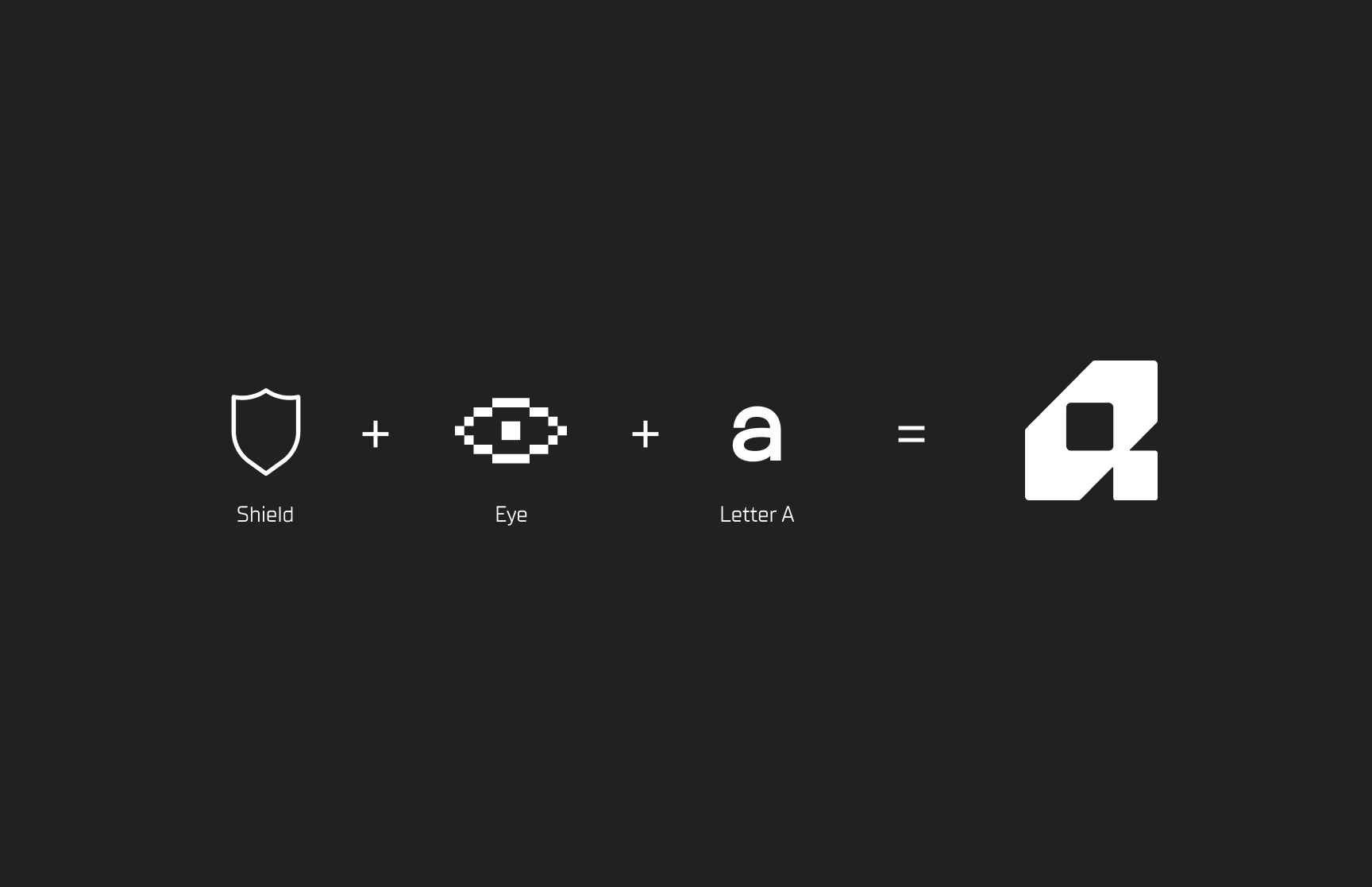
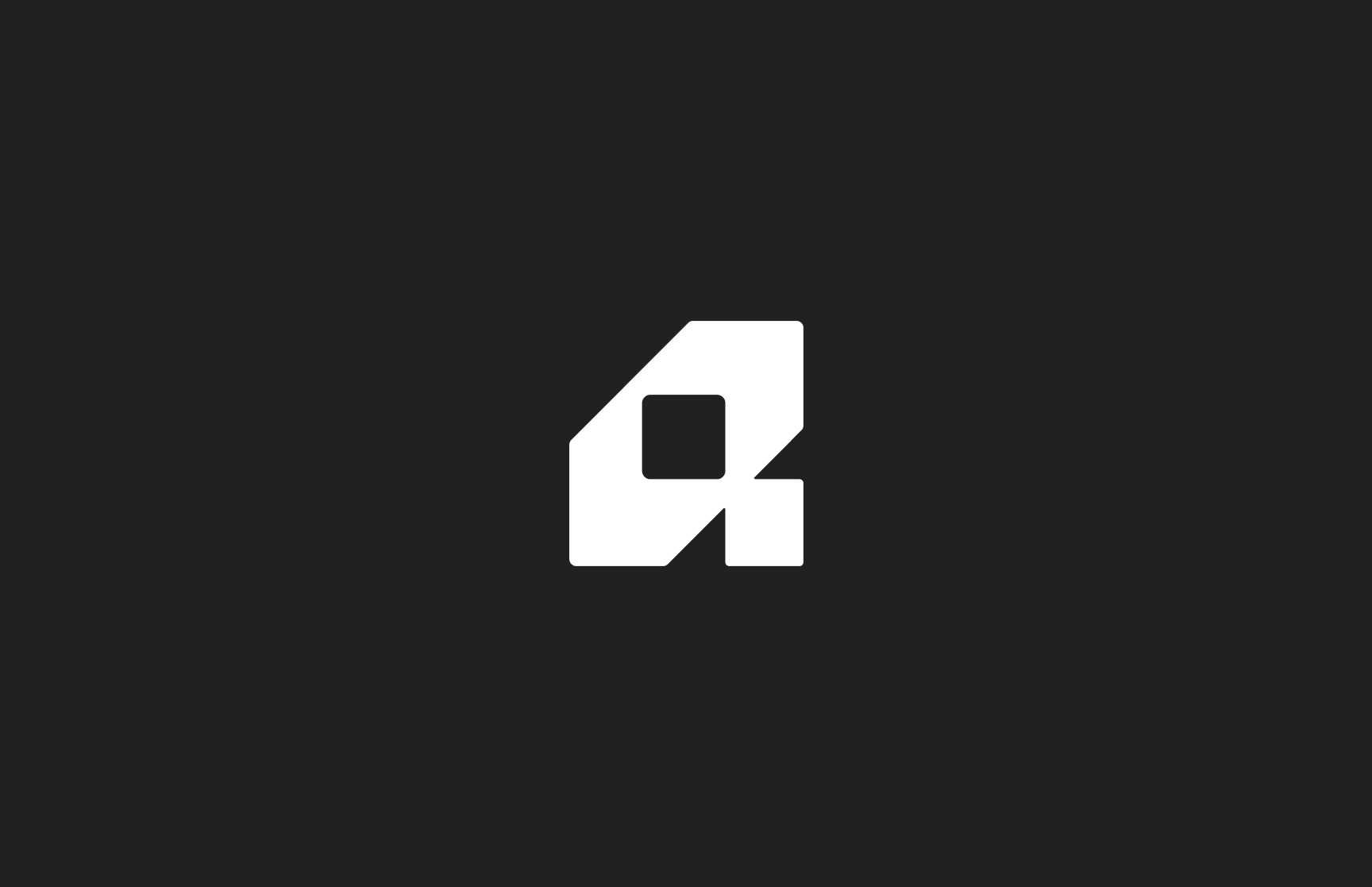
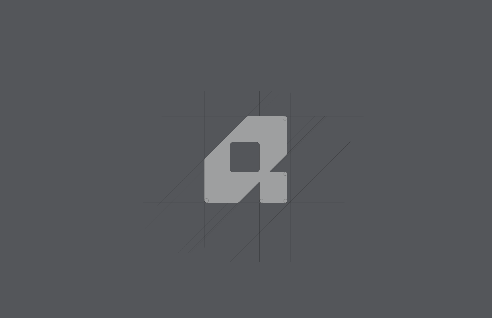
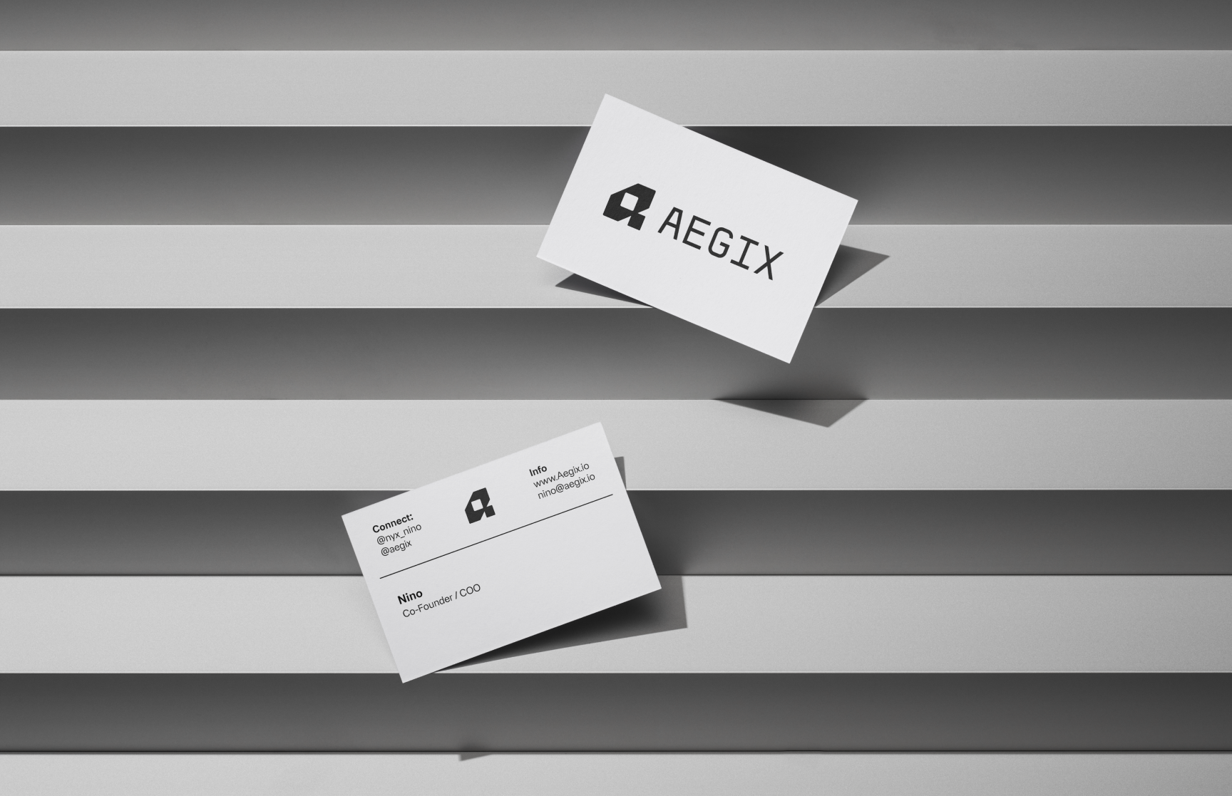
I designed the Aegix monogram by integrating three elements into one geometric form: a shield for protection, an eye for vigilance and intelligence, and the letter “A” for the company name. Rather than treating these as separate symbols, I used a shared structure so the meaning reveals itself gradually. From a distance, the mark reads as a stable shield; at closer range, the eye and letterform become visible. This balance gave the logo immediate authority without making it visually literal.
A Digital Signal Inside a Fortified Form
The eye at the center of the mark uses a pixel-influenced construction to reference cyber intelligence, digital foresight, surveillance, and real-time threat detection. Placing that signal inside the shield connected the company's physical and digital security practices rather than presenting them as separate offerings. The result is a compact symbol that can operate as a corporate monogram, interface icon, security seal, or restrained identifying detail.
Typography: Institutional Clarity Meets Cyber Intelligence
The identity uses a dual-typeface system to balance corporate credibility with a distinct technical voice. FH Oscar Pro serves as the primary family, bringing clarity, precision, and contemporary structure to headlines, body copy, and formal communications. PP Mondwest provides the accent layer, using pixel-inspired forms to evoke cybersecurity and digital intelligence. I reserved it for labels, metadata, coordinates, and moments of emphasis so the technological character remained purposeful rather than decorative.
Color: Confidence Without Visual Noise
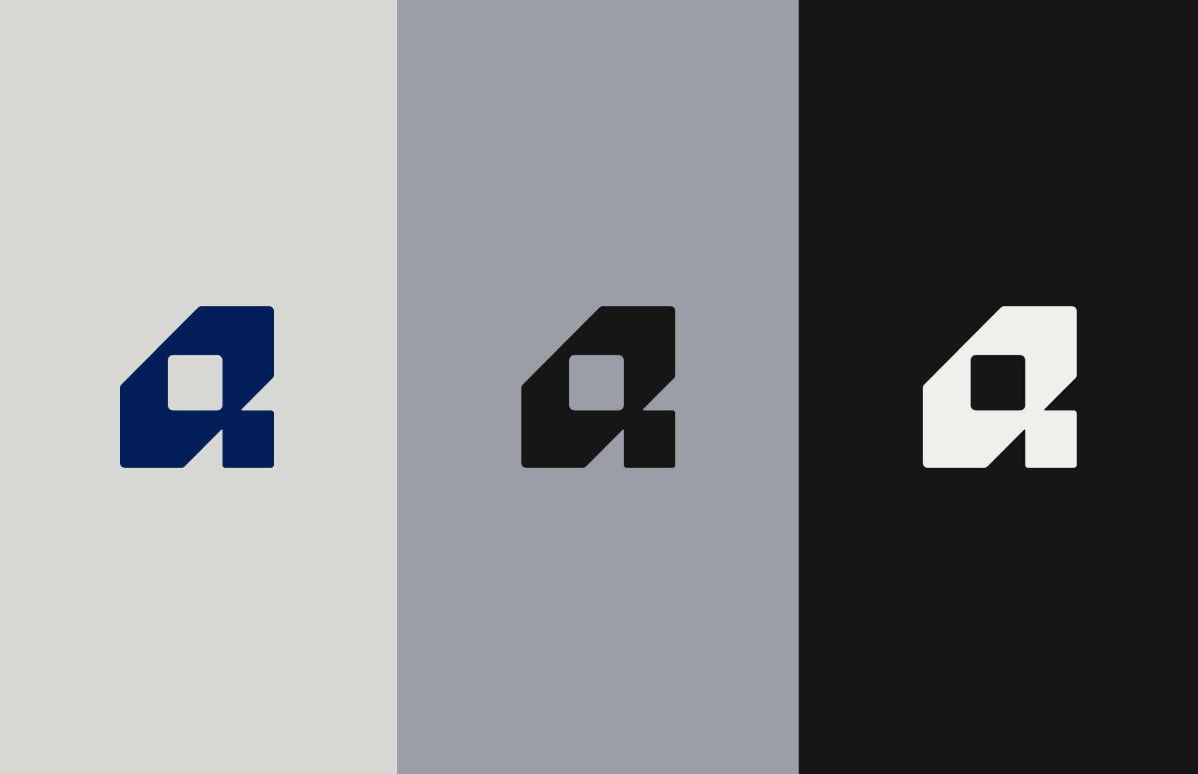
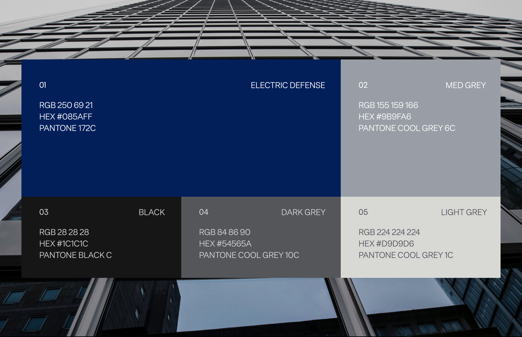
Electric Defense Blue anchors the system, introducing a clear technological signal while retaining the familiarity and trust traditionally associated with blue. Deep Black provides contrast, discretion, and authority, while a range of cool greys supports information hierarchy and flexibility across digital and printed materials. The palette was intentionally controlled: blue identifies key actions and brand moments, while neutral surfaces allow sensitive, technical, or high-density content to remain composed and legible.
Designing for Discretion
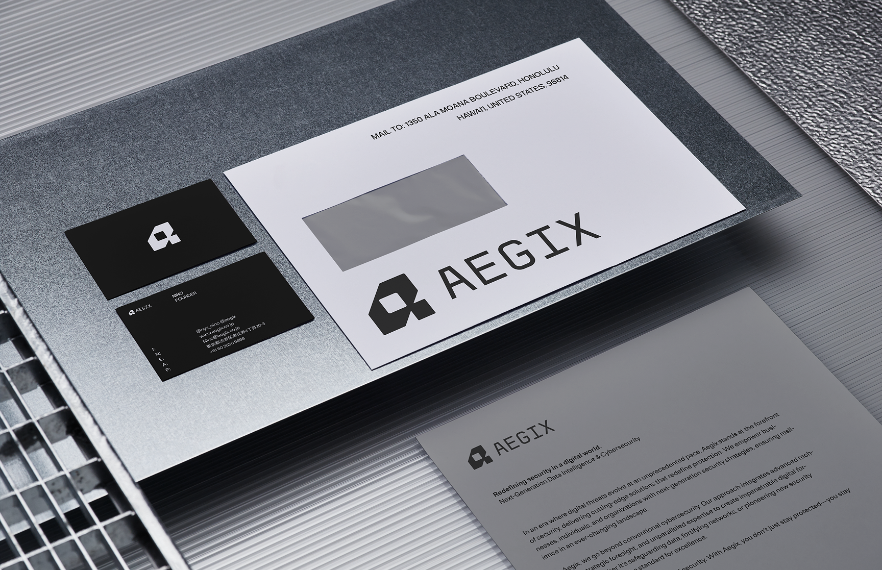
A security brand cannot rely on constant visual intensity. Many of its most important interactions happen in proposals, credentials documents, private briefings, and executive communications where restraint carries more authority than spectacle. I designed the system to move between two modes: a minimal institutional mode for formal client communication and a more technical mode for cybersecurity and digital touchpoints. Shared typography, spacing, and mark behavior keep both expressions recognizably Aegix.
Building the Foundation for a Digital Presence
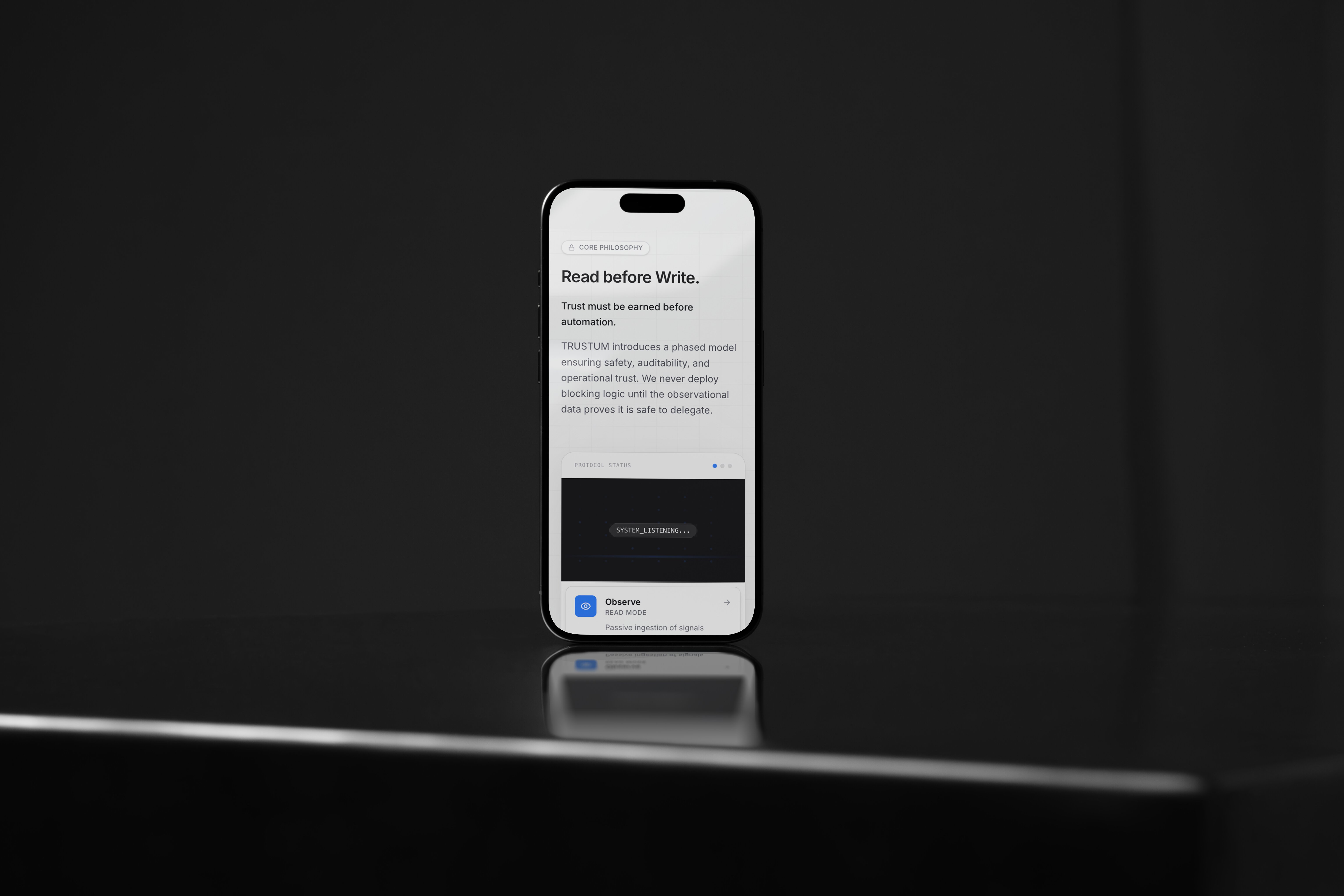
The identity was structured to extend into the Aegix website and future digital products. I defined how the logo, typography, color, imagery, and technical accent language could support service explanations, team credentials, case studies, and confidential contact pathways. Rather than designing a brand that only worked in presentation mockups, I treated responsive behavior, interface hierarchy, and repeatable content patterns as part of the identity from the beginning.
Outcome & Reflection
The final identity gave Aegix a coherent way to present three distinct security disciplines under one name. Its strength comes from controlled duality: physical protection and cyber intelligence, institutional authority and future-facing technology, visible confidence and operational discretion. The project reinforced that trust is not created by making a security brand appear more aggressive; it is created through consistency, clarity, and disciplined communication. If extending the system today, I would add formal motion principles, accessibility standards, and additional guidance for data-rich security products.